Bar charts sort the given hierarchies and measures into bars. The hierarchy added to the Categories zone will be represented on the y-axis, and the measure in the Values zone will be on the x-axis. Like column charts, bar charts must contain at least 1 member hierarchy and 1 measure. Member hierarchies can be added to the Categories or Color drop zones, and measures to the values zone.

Build a Bar Chart
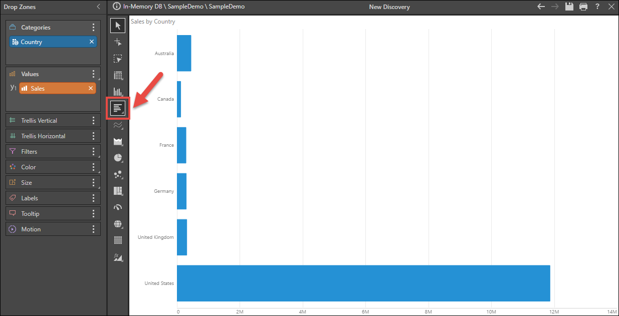
Step 1
To the Categories zone, add the member hierarchy that should be displayed on the y-axis; to the Values zone, add the measure that should be displayed on the x-axis.
Be sure to select Bar Chart from the Visualization menu (red highlight below).
Step 2
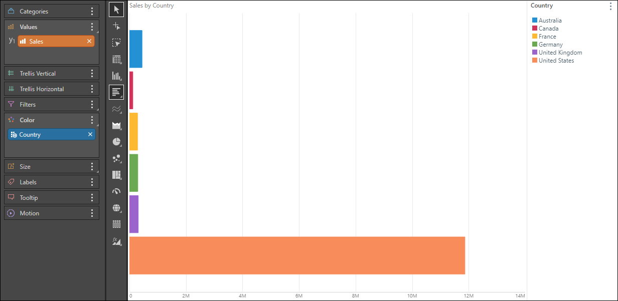
Color
To add a color dimension to the query, you can move the member hierarchy from Categories to Color:
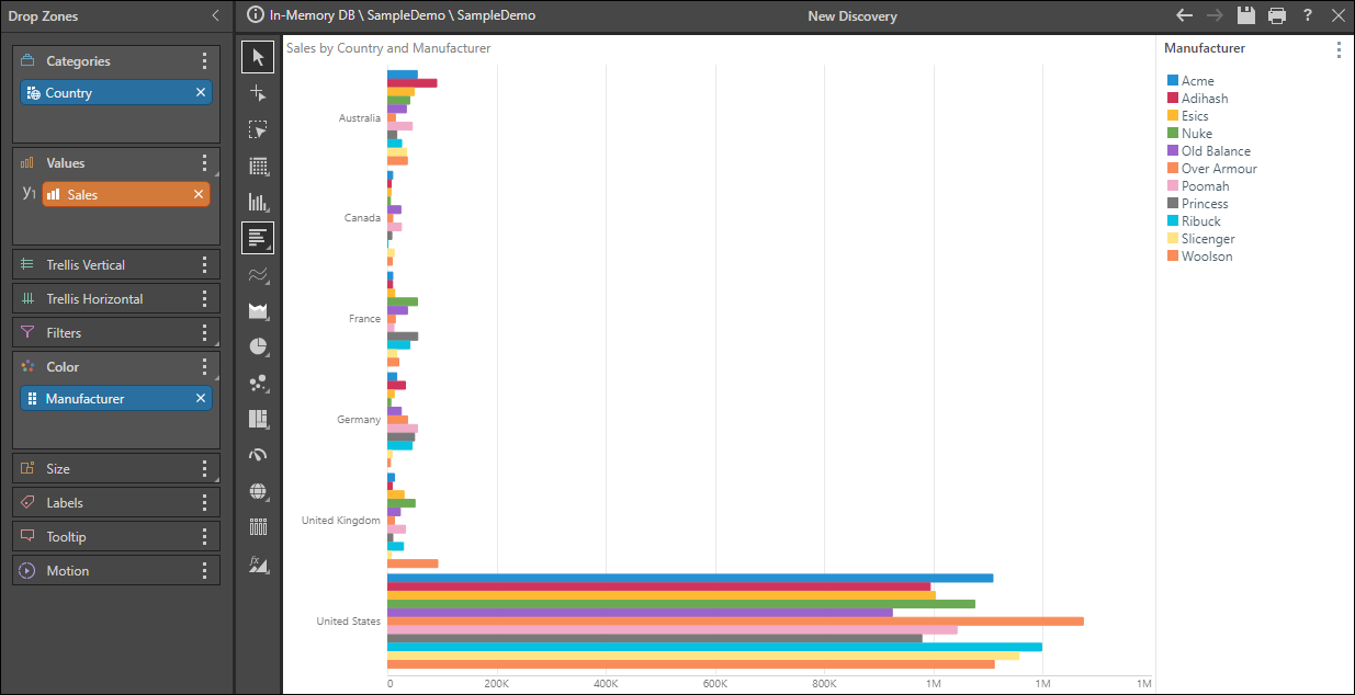
Multiple Hierarchies
Alternatively, add a second member hierarchy to Color:
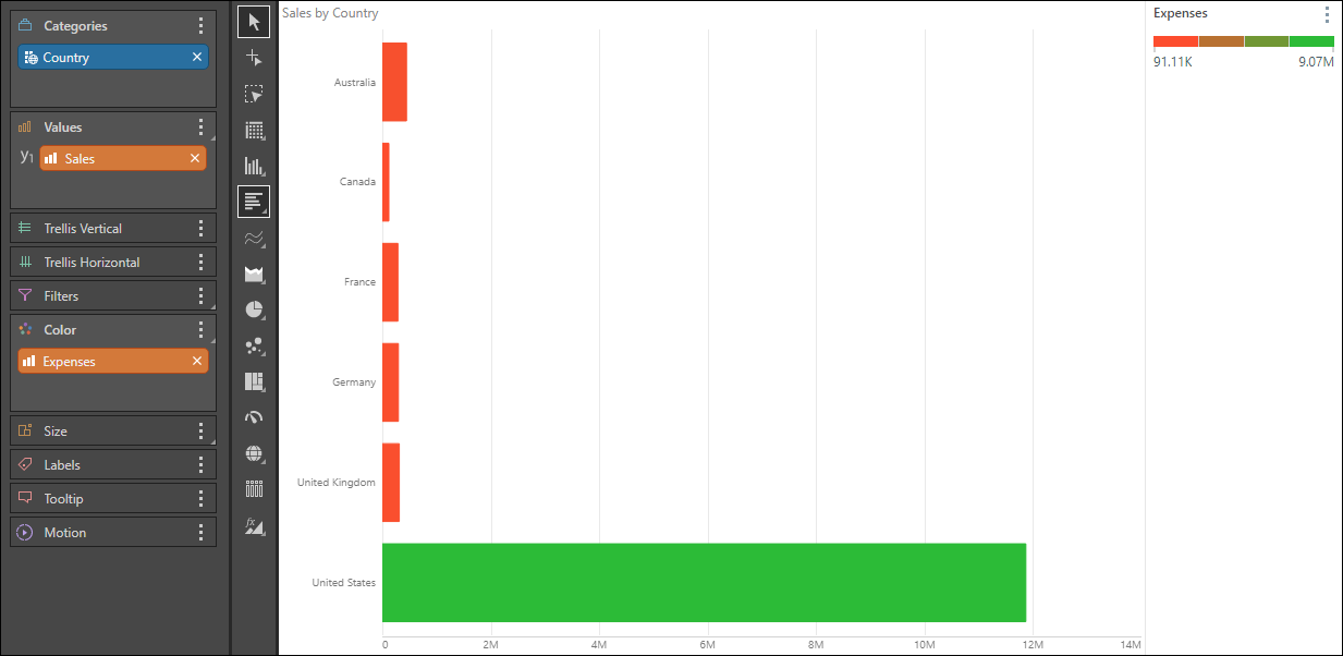
Measure Colors
Measures can also be used to drive the color of the bars: